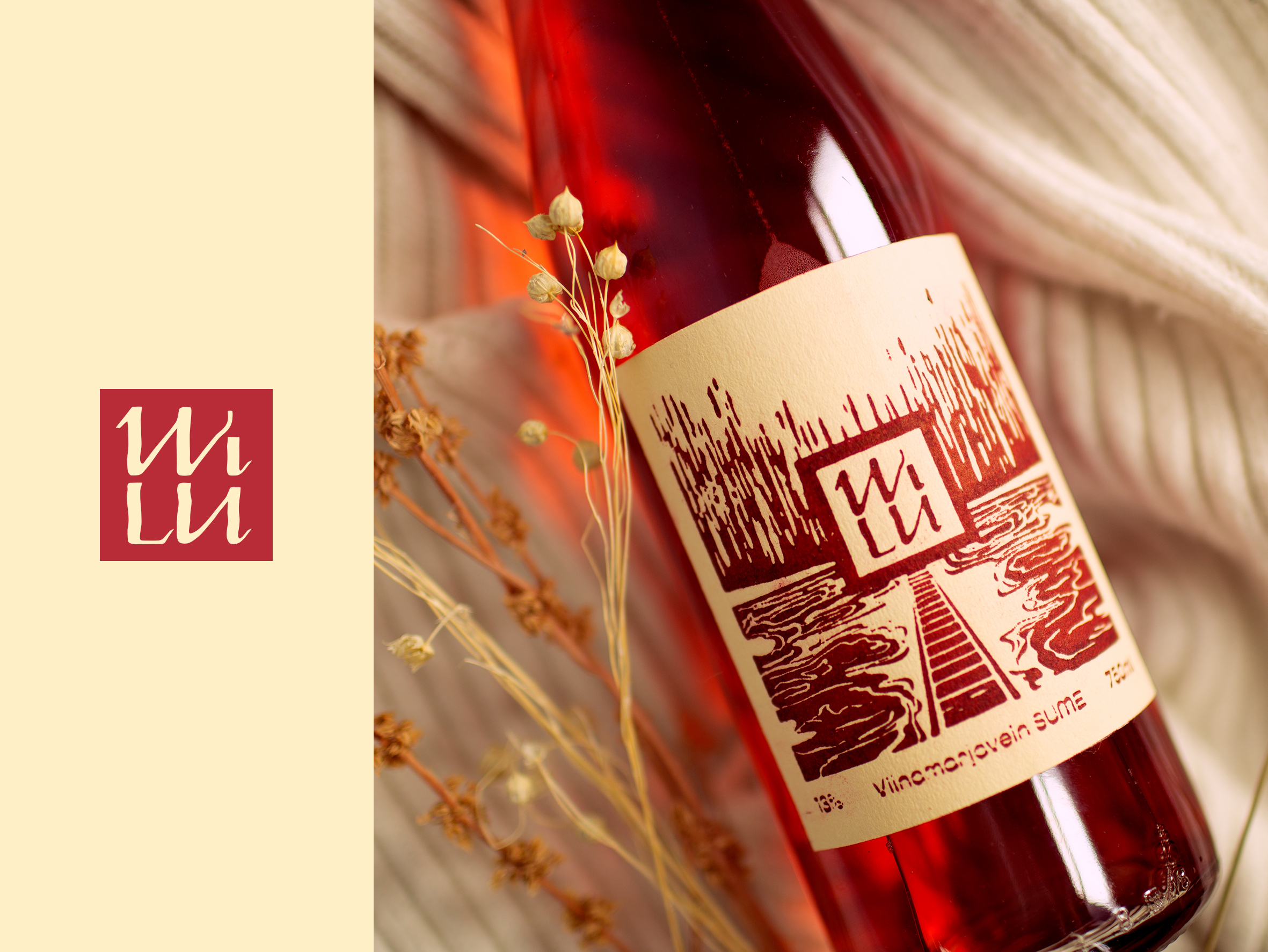


Käesoleva lõputöö teema on visuaalse identiteedi loomine koduveini tootjale WILU. Ülesandeks on luua eristuv ning konkurentsivõimeline logo ja etiketidisain, millega tulevikus turule tulla. Veini loovad ja toodavad tavalised inimesed, kes armusid veini valmistamisse aastal 2019. Liivika ja Indrek, kes on selle meeliköitva kodumaise toodangu autoriteks, on minu vanemad. Liivikal saab varsti täis 25 aastat tööstaaži Politsei- ja Piirivalveametis ning ees terendab noore pensionäri staatus. Lõputööna valmiv tulemus on kingitus emale. Otsustasin luua talle „4. pensionisamba“, võimaluse soovi korral edasiselt tegeleda millegagi, mida ta samuti naudib. Lõputöö eesmärgiks on luua enda pere valmistatud koduveinile visuaalne identiteet ja ka roosale viinamarjaveinile etiketidisain, et anda vanematele omaltpoolt kõik visuaalsed vahendid ettevõtte loomiseks. Etiketi disaini ja näidisetiketid loon roosale viinamarjaveinile „SUME“. Visuaalse identiteedi all plaanin teha logo, valin ettevõttele sobivad värvid ning loon ka pildikeele, mida saab tulevikus sotsiaalmeedia turunduses kasutada. Viimasena tahan panna kokku pildimaterjali võimalikest rakendustest logoga, et visualiseerida võimalusi selle kasutamisest.
The aim of this thesis is to create visual identity for domestic wine company WILU. In addition to that I will create an illustration and wine label design for pink grape wine named „SUME“ .In the first half of this thesis I examined the nature and importance of the company’s visual identity. Since the visual identity works as the face of the company, it must be created with appropriate care and dignity. It is important to visually convey to a potential client the same values that work within the company. In the following chapter, I will also determine WILU’s competitors and review their visual identities. I looked and thoroughly analysed logos of the main five competitors. I discovered that some details and symbols were recurring. It is also quite common to use some particular animal in logo. Based on the comment, I made decisions to distinguish WILU from other manufacturers. In the second part of the thesis I started with explanations who is WILU, what do they do and why. Followed by a creative process that resulted in the WILU logo, a label design, a brand book for future social media marketing and some possible uses with the visual identity. To do that I took some keywords from the competitor analysis: square, typography and negative space. These are elements which potential has not been exploited to the full extent. And I think this gives WILU an advantage when entering the domestic wine market. First, I made some logo designs by hand with ink and pen, further work continues in Illustrator, where I worked on details until I found the final balanced product. Parallel with logo design I was working on the illustration as well. The same way I started on paper with charcoal and textured paper and when I was happy with the sketch I moved to computer. The next task was to assemble the wine bottle label from the illustration and logo. With this I had to choose appropriate label size according to the bottle used by WILU. I also had to find balance between the premade visual element. After that I started with printing process. Firstly, I cut
the design into a linol and then use letterpress to get a print. Using this a made files for laser cutter, which made 4 identical designs into one linol. That gives opportunity to WILU to create 4 labels at once. Finally I made sample bottles with „SUME“ labels, a guide for the company, in which I outlined the use of the logo, colours and fonts. I also added an image framework for social media marketing in the future. With all this I believe WILU has all the tools to create a company and successfully share their work.
